📚 Learn & Reference
Section 1 — Reading Each Chart
1. GEX Profile
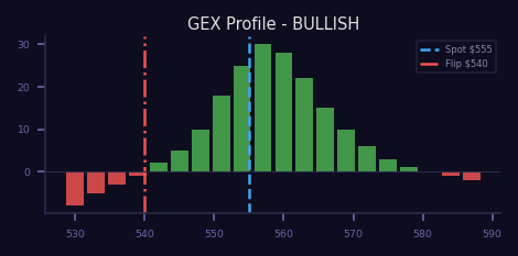
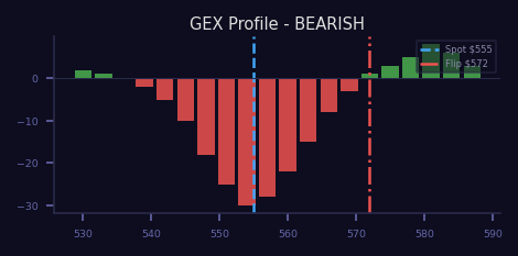
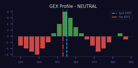
Net gamma exposure by strike. Green bars = positive gamma (stabilizing);
red bars = negative gamma (amplifying). The gamma flip level marks where
dealer behavior inverts.
What to look for
- Location and sign of the largest gamma bar relative to spot
- Where the gamma flip level sits vs. current price
- Width of the positive-gamma zone (wider = more stable)
✔ Bullish
Large positive gamma clustered above spot. The flip level sits well below
current price. Dealers buy dips and sell rips, pinning price in a stable range.
✘ Bearish
Negative gamma dominates. The flip level is above spot, meaning price is in
the amplification zone where dealers sell into weakness and buy into strength.
— Neutral
Balanced positive and negative bars. Flip level sits near spot. Dealers have
minimal directional bias; price drifts without strong hedging pressure.
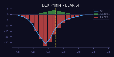
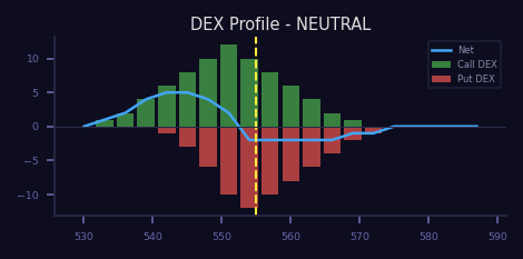
2. DEX Profile
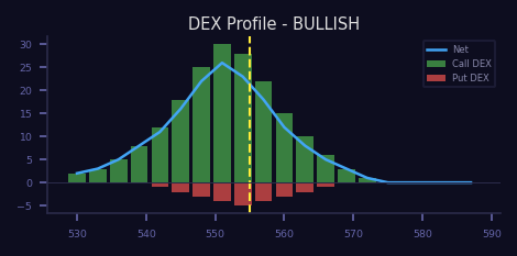
Dealer delta exposure by strike. Green bars = dealers long stock (hedging
short calls); red bars = dealers short stock (hedging short puts). Net direction
shows the aggregate delta tilt of the options market.
What to look for
- Color dominance: mostly green vs. mostly red
- Magnitude of the largest bars and where they cluster
- Net delta direction relative to spot
✔ Bullish
Large green bars dominate. Call hedging forces dealers long stock,
providing a supportive bid underneath the market.
✘ Bearish
Large red bars dominate. Put hedging forces dealers short stock,
creating persistent selling pressure overhead.
— Neutral
Balanced red and green bars with no clear directional lean.
Dealers are roughly delta-neutral across strikes.
3. 3D GEX Surface
Gamma exposure plotted across strikes (Y) and expirations (X). Peaks show
where hedging pressure concentrates. Multiple peaks across different
expirations indicate multiple price magnets.
What to look for
- Height and location of the tallest peaks relative to spot
- Whether peaks cluster above or below spot
- Spread across expirations: concentrated near-term vs. evenly distributed
✔ Bullish
Tall positive peaks clustered above spot. Dealers are positioned to
absorb selling, creating a wall of support at higher prices.
✘ Bearish
Deep negative valleys or peaks concentrated below spot.
Hedging flows amplify any move lower.
— Neutral
Even distribution of modest peaks across both sides of spot.
No single dominant hedging cluster.
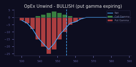
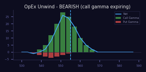
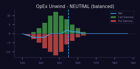
4. OpEx Unwind
Shows which gamma expires at the nearest expiration. When that gamma rolls off,
dealers must unwind the hedge. Put gamma expiring = dealers buy back stock;
call gamma expiring = dealers sell stock.
What to look for
- Color of the bars expiring: green (calls) vs. red (puts)
- Total size of expiring gamma relative to remaining open interest
- Strikes where the biggest unwinds will happen
✔ Bullish
Mostly put gamma expiring. Post-OpEx, dealers will BUY stock
to close their put hedges, providing an upside tailwind.
✘ Bearish
Mostly call gamma expiring. Post-OpEx, dealers will SELL stock
to close their call hedges, creating a downside headwind.
— Neutral
Balanced put and call gamma expiring. Unwind flows roughly cancel out.
Post-OpEx direction depends on other factors.
5. IV Skew
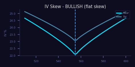
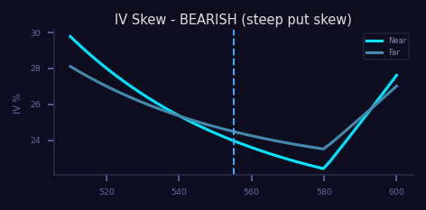
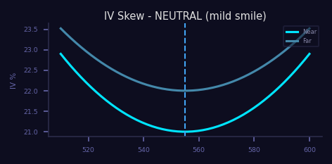
Implied volatility plotted across strikes for each expiration. Bright lines
are near-term; dim lines are far-term. The shape reveals directional hedging
demand and crash insurance pricing.
What to look for
- Steepness of the put wing (left side) vs. call wing (right side)
- Whether the skew is shifting between expirations
- Changes in skew over time (flattening = complacency, steepening = fear)
✔ Bullish
Flat or slightly positive skew. Calls are relatively expensive compared
to puts, signaling upside demand exceeds downside hedging.
✘ Bearish
Steep negative skew. Puts are far more expensive than calls,
reflecting heavy fear and crash-protection demand.
— Neutral
Mild symmetric smile. Both wings are moderately priced.
No strong directional tilt in hedging demand.
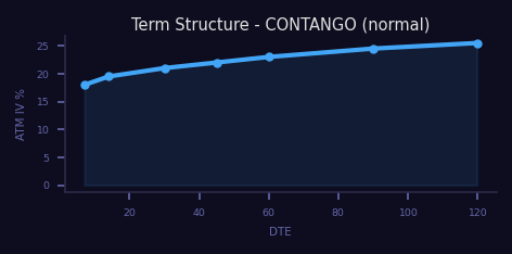
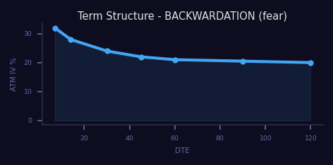
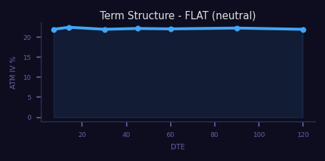
6. IV Term Structure
ATM implied volatility plotted across expirations from near-term to far-term.
The slope tells you where the market expects volatility to be concentrated
and whether event risk is priced into the front end.
What to look for
- Upward slope (contango) vs. downward slope (backwardation)
- Kinks at specific expirations (event-driven vol spikes)
- Overall level of the curve (high vs. low IV environment)
✔ Bullish
Contango: normal upward slope with near-term IV lower than far-term.
No imminent event risk priced in. Calm, orderly market.
✘ Bearish
Backwardation: inverted curve with near-term IV spiking above far-term.
Market is pricing imminent event risk or panic hedging demand.
— Neutral
Flat curve. Similar IV across expirations. No strong event risk
priced in, but no complacency discount either.
7. 3D IV Surface
Implied volatility mapped across strikes (Y) and days-to-expiry (X).
Combines skew and term structure into a single surface. The evolving shape
over time reveals how the vol regime is shifting.
What to look for
- Overall height of the surface (elevated vs. subdued IV environment)
- Steepness of put and call wings at each expiry
- Whether the surface is smooth or contains sharp ridges (event pricing)
✔ Bullish
Smooth, low surface with a gentle symmetric smile. IV is subdued
across strikes and expirations. No panic priced in.
✘ Bearish
Elevated surface with a steep put wing. Near-term expiries show
the sharpest smile, reflecting acute downside fear.
— Neutral
Symmetric smile at moderate levels. Both wings are priced evenly.
Surface is smooth with no pronounced ridges.
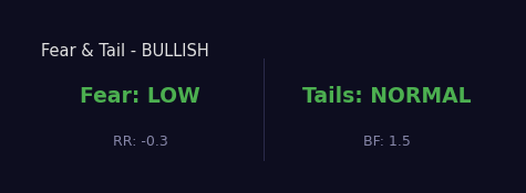
8. Fear & Tail Risk
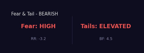
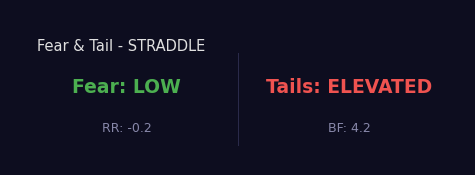
Two-axis framework. Risk Reversal (RR) measures directional put demand
(negative = fear). Butterfly (BF) measures non-directional extreme-move
pricing. Together they form a 2×2 matrix of market states.
What to look for
- RR sign and magnitude (negative = put demand, i.e., directional fear)
- BF level (elevated = market pricing big moves in either direction)
- The combination: Fear + Tails together tell you which quadrant you are in
✔ Bullish (complacent)
Fear LOW, Tails NORMAL. Market is relaxed. Put demand is light.
No extreme-move premium. Classic grind-higher environment.
✘ Bearish (panic)
Fear HIGH, Tails ELEVATED. Heavy directional put demand AND
extreme-move pricing. Full-blown risk-off. Hedging at a premium.
— Neutral / Straddle
Fear LOW, Tails ELEVATED. No directional fear, but the market
prices a big move in either direction. Classic straddle environment.
9. Probability Distribution (Breeden-Litzenberger)
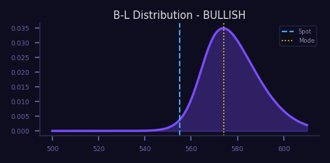
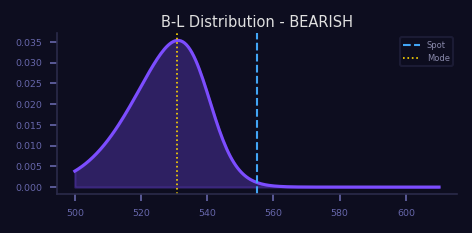
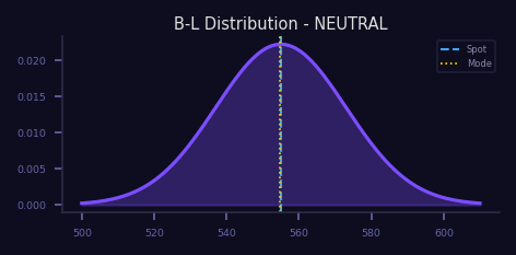
The market-implied probability of each price at expiry, extracted directly from
option prices. Unlike Black-Scholes (which assumes lognormal), B-L reveals the
actual distribution the market is pricing, including fat tails and skew.
What to look for
- Location of the mode (peak) relative to spot
- Symmetry or skew of the distribution
- Thickness of the tails (fat tails = elevated crash/melt-up probability)
✔ Bullish
Mode sits above spot. Thin left tail, possibly a fatter right tail.
Market-implied probability favors upside outcomes.
✘ Bearish
Mode sits below spot. Fat left tail signals elevated crash probability.
Distribution is negatively skewed.
— Neutral
Roughly symmetric distribution centered near spot. Tails are even
on both sides. No strong directional lean.
10. Monte Carlo Cone
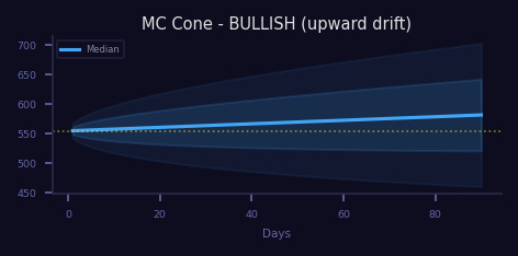
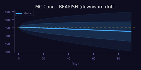
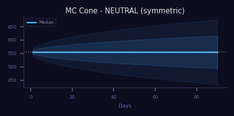
5,000 simulated price paths forward using current volatility and drift.
The inner band captures 50% of outcomes; the outer band captures 90%.
Width = uncertainty.
What to look for
- Tilt of the median path (upward, downward, or flat)
- Width of the cone (wider = higher expected volatility)
- Asymmetry of the bands (upside vs. downside spread)
✔ Bullish
Cone tilted upward with positive drift. The median path rises
and the lower band stays above key support levels.
✘ Bearish
Cone tilted downward. Median path declines and the upper band
struggles to reclaim the starting price.
— Neutral
Symmetric cone centered around spot with minimal drift.
Equal probability of moving up or down over the horizon.
11. Constrained MC / EoY Projection
SMA200 tangent line sets a year-end Fibonacci target. MC simulation runs
5,000 paths and keeps only those where SMA200 reaches the target. Surviving
paths form the constrained cone. All SMA projections come from these valid paths.
What to look for
- Survival rate: what % of paths reach the target
- Confluence score: how many SMAs (50/100/200) confirm the target
- Width of the constrained cone (narrower = higher confidence)
✔ High Confidence
Survival rate >30%. Confluence 3+/4 (multiple SMAs agree).
Constrained cone is narrow with a clear directional path.
✘ Low Confidence
Survival rate <10%. Confluence 1/4 or less.
The target requires an improbable path for SMA200.
— Moderate
Survival rate 10-30%. Confluence 2/4. Some support for the
projection but significant uncertainty remains.
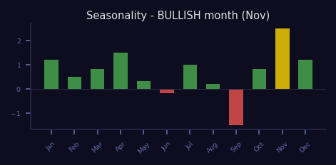
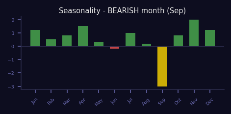
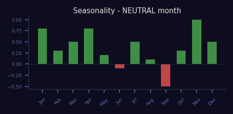
12. Seasonality
Historical average monthly returns over maximum available history. Shows which
months have historically been strongest or weakest. Use as a directional bias
filter, not a standalone trade signal.
What to look for
- Current month's historical average return (green or red bar)
- Adjacent months for multi-month seasonal trends
- Historical win rate for the current month
✔ Bullish months
Historically strong: November and April lead. These months show
consistent positive average returns across most tickers.
✘ Bearish months
Historically weak: September is the worst month on average.
Often coincides with Q3 portfolio rebalancing.
— Neutral
Varies by ticker. Some months show near-zero average returns
or mixed win rates. No reliable directional bias.
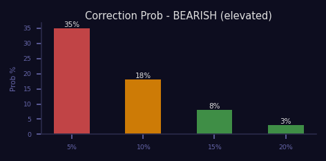
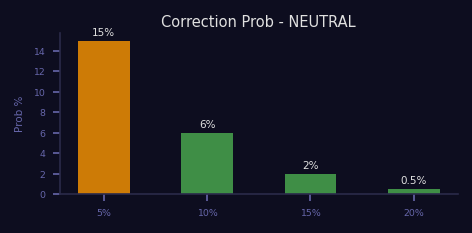
13. Correction Probability
Estimated probability of various drawdown magnitudes (5%, 10%, 15%, 20%)
at multiple forward horizons (7d, 14d, 30d, 60d, 90d). Derived from
current volatility, skew, and historical correction frequency.
What to look for
- The 10% correction probability at 30 days (primary risk gauge)
- Whether probabilities are rising or falling vs. the prior reading
- How quickly probabilities decay across time horizons
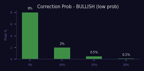
✔ Bullish
Low probabilities across all horizons and magnitudes.
The 10% correction probability at 30d is well below historical average.
✘ Bearish
Elevated 10%+ correction probability at 30d. Multiple magnitudes show
above-average probabilities, signaling persistent fragility.
— Neutral
Probabilities near their historical averages. No acute risk but
no complacency discount either. Standard risk environment.
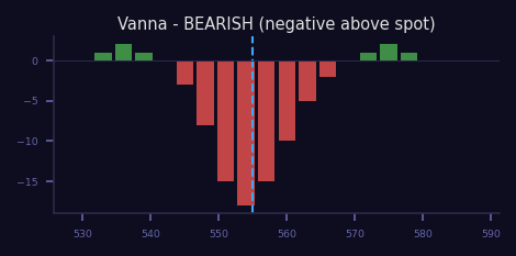
14. Vanna
Sensitivity of delta to changes in implied volatility. When IV drops (e.g.,
post-earnings vol crush), positive vanna pushes dealers to buy stock. This is
why volatility compression after events often triggers rallies.
What to look for
- Sign and magnitude of vanna above vs. below spot
- Expected direction of IV (dropping after events vs. rising into events)
- Concentration of vanna at specific strikes
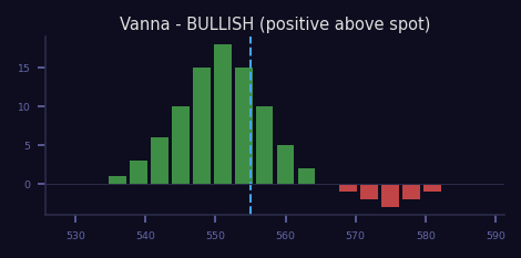
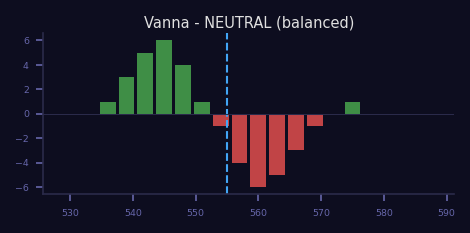
✔ Bullish
Positive vanna above spot. When IV drops, dealers buy stock to
re-hedge. Post-earnings vol crush drives supportive flows.
✘ Bearish
Negative vanna dominates. When IV drops, dealers sell stock.
When IV rises, it compounds the selloff through forced hedging.
— Neutral
Balanced vanna. IV changes produce offsetting hedging flows.
Key: vanna is the primary driver of post-earnings direction.
15. Charm
Delta decay over time. Shows how dealer hedging changes as options approach
expiry, even without price movement. Key driver of end-of-day flows and
OpEx week drift. Large charm near expiry = aggressive dealer rebalancing.
What to look for
- Sign of net charm (positive = time drives buying; negative = selling)
- Magnitude spike as OpEx approaches
- Concentration at specific strikes near spot
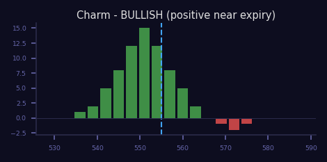
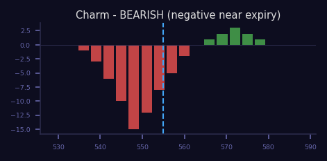
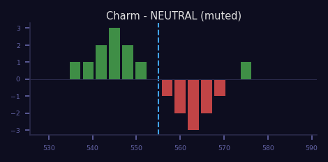
✔ Bullish
Positive charm drives end-of-day buying. As time passes, dealers
must accumulate stock. OpEx week sees amplified late-day bids.
✘ Bearish
Negative charm drives end-of-day selling. Dealers shed stock
as time passes. OpEx week sees persistent late-day offers.
— Neutral
Minimal net charm. Time decay does not produce significant
directional hedging flows. Key: charm is strongest during OpEx week.
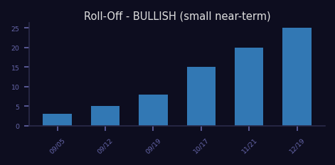
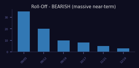
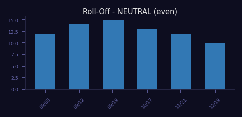
16. Gamma Roll-Off
Gamma expiring at each upcoming expiration date, shown as bars. The nearest-term
bar represents imminent unwind risk. Large near-term bars mean significant
hedging flow will be released when that expiration passes.
What to look for
- Size of the nearest-term expiration bar vs. subsequent bars
- Total gamma across all bars (cumulative unwind exposure)
- Whether the roll-off is front-loaded (concentrated risk) or distributed
✔ Bullish
Small near-term gamma bar. Low unwind risk at the next expiration.
Hedging flows remain stable through the roll.
✘ Bearish
Massive near-term gamma bar. Big unwind coming at the next
expiration. Expect elevated volatility around the roll date.
— Neutral
Evenly distributed gamma across expirations. No single date
dominates. Unwind risk is spread out over time.
Section 2 — Regime Identification
No single chart tells the full story. Combine signals across multiple chart types to identify the prevailing regime. The table below shows what each regime looks like when you read the charts together.
| Regime | Gamma / DEX | Volatility | Sentiment / MC |
|---|---|---|---|
| 🟢🟢 STRONGLY BULLISH | Positive gamma, flip well below spot. DEX strongly green (positive delta). | Contango (normal term structure). Flat or positive skew. | Fear LOW, Tails NORMAL. MC cone tilted up. B-L mode above spot. |
| 🟢 BULLISH | Positive gamma, flip below spot. DEX flat-to-green. | Contango. Mild put skew. | Moderate fear. MC cone gently upward. Correction probability low. |
| — NEUTRAL | Gamma near zero, flip at spot. DEX balanced. | Flat term structure. Symmetric smile. | Mixed signals. MC cone symmetric. B-L centered at spot. |
| 🔴 BEARISH | Negative gamma, flip above spot. DEX skewed red (negative delta). | Backwardation forming. Steep put skew. | Fear HIGH. MC cone tilted down. Correction probability elevated. |
| 🔴🔴 STRONGLY BEARISH | Deep negative gamma. Heavy put DEX dominance. Flip far above spot. | Inverted term structure. Extreme put skew. IV surface elevated. | Panic: Fear HIGH + Tails ELEVATED. MC cone sharply down. Fat left tail in B-L. |
Section 3 — Backtest Strategy Reference (19 Strategies)
● Golden Cross — SMA50 crosses above SMA200
● Death Cross — SMA50 crosses below SMA200
● RSI Oversold Bounce — RSI crosses above 30
● RSI Overbought — RSI drops below 70
● MACD Bullish Cross — MACD line crosses above signal
● MACD Bearish Cross — MACD line crosses below signal
● Vol Contraction Breakout — Close > upper band
● Vol Contraction Breakdown — Close < lower band
● SMA20 Momentum — ATR slope > 1.5 in 10d
● SMA50 Momentum — ATR slope > 2.0 in 20d
● SMA Confluence — All slopes up + price stacked above all SMAs
● RSI Extreme Oversold — RSI < 5 (capitulation)
● RSI Extreme Overbought — RSI > 95 (blow-off top)
● Bollinger Squeeze — Width at minimum + upper break
● New High Declining Vol — Distribution pattern
● ATR Contraction — Coiled spring > SMA200
● Accumulation Breakout — 3 higher lows + breakout
● Volume Climax Reversal — 3-sigma volume at low
● Gap Fill Long — Gap down then fill
Section 4 — Glossary
Positive Gamma — Dealers buy dips, sell rips (stabilizing, mean-reverting behavior)
Negative Gamma — Dealers sell dips, buy rips (amplifying, trend-following behavior)
Gamma Flip — The strike where dealer gamma switches from positive to negative. The most important single level for intraday direction.
Pin Level — Max OI strike where price is magnetically attracted near expiry (max pain theory)
Max Pain — Strike where the most options expire worthless, minimizing aggregate payout to option holders
Put Wall — Highest put OI strike. Acts as support because dealers buy stock to hedge short puts here.
Call Wall — Highest call OI strike. Acts as resistance because dealers sell stock to hedge short calls here.
GEX — Gamma Exposure. Net gamma across all strikes, determining whether dealers stabilize or amplify moves.
DEX — Delta Exposure. Net dealer delta across strikes, showing the directional tilt of hedging flows.
IV — Implied Volatility. The market's forward-looking expectation of price movement, derived from option prices.
RV — Realized Volatility. Actual historical price movement over a lookback window. Compare to IV for edge.
OI — Open Interest. Total outstanding option contracts at a given strike and expiry.
DTE — Days to Expiration. Time remaining until an option contract expires.
OpEx — Options Expiration. Typically the third Friday of each month (monthly); also weekly and quarterly.
GBM — Geometric Brownian Motion. The stochastic model underlying Monte Carlo simulation: drift + random volatility.
ATR — Average True Range. Volatility measure that normalizes across price scales. Used for position sizing and breakout detection.
Contango — IV term structure slopes upward (normal). Near-term IV is lower than far-term. Indicates a calm market.
Backwardation — IV term structure is inverted. Near-term IV spikes above far-term, pricing imminent event risk.
Skew — The tilt of the IV curve across strikes. Negative skew (puts expensive) = fear. Positive skew (calls expensive) = greed.
Butterfly (BF) — Measures non-directional extreme-move pricing. Elevated BF = market expects a big move but is uncertain of direction.
Risk Reversal (RR) — Measures directional put vs. call demand. Negative RR = puts more expensive (fear). Positive = calls more expensive.
Vanna — Sensitivity of delta to IV changes. Post-earnings vol crush + positive vanna = dealers buy stock. Key second-order Greek.
Charm — Delta decay over time. Drives end-of-day and OpEx-week hedging flows even without price movement.
B-L Distribution — Breeden-Litzenberger. Risk-neutral probability density extracted from option prices. Reveals the true market-implied distribution.
Confluence — When multiple independent signals agree on the same direction. Higher confluence = higher conviction.
Survival Rate — In the constrained MC projection, the % of simulated paths that reach the target. Higher = more probable scenario.
Section 5 — Reading the Proximity Scanner
The "Signals Brewing" panel shows strategies approaching their trigger threshold
across the S&P 100. Each row is a strategy/ticker pair with a proximity
percentage showing how close it is to firing.
Bias indicators:
🟢 Bullish
🟢🟢 Very bullish (>85%)
🟢🟢🟢 Extreme bullish (3+ signals same direction)
🔴 Bearish
🔴🔴 Very bearish
🔴🔴🔴 Extreme bearish confluence
Proximity bar colors:
Green (<70%) = approaching. Yellow (70-85%) = close. Red (>85%) = imminent trigger.
Confluence upgrade:
When 2+ signals for the same ticker point the same direction, all get upgraded.
A "3x confluence" badge means three independent strategies are simultaneously
near-trigger for that ticker — the strongest signal the scanner produces.
Cluster count:
For strategies that can fire repeatedly (RSI extremes, new highs on declining
volume, accumulation breakout), a red badge like "3x" means the signal fired
3 times within the clustering window — indicating sustained intensity.
How to use it:
Filter by ticker or direction to find actionable setups. Cross-reference
scanner hits with the GEX/DEX regime for that ticker. A bullish scanner
signal in a positive-gamma regime is much higher conviction than one in
a negative-gamma environment.